The Top 11 MLB City Connect Uniforms Right Now

Teams are trying to reinvent what their players wear by making the most colorful, flashy, and blinding uniforms possible. They are called city connect jerseys, and are basically alternatives to their regular uniforms. Some are very good, while others are downright terrible. Here are my top 11 city connect uniforms. Starting with 11. (8/11 of the photos used were originally on ESPN here.)
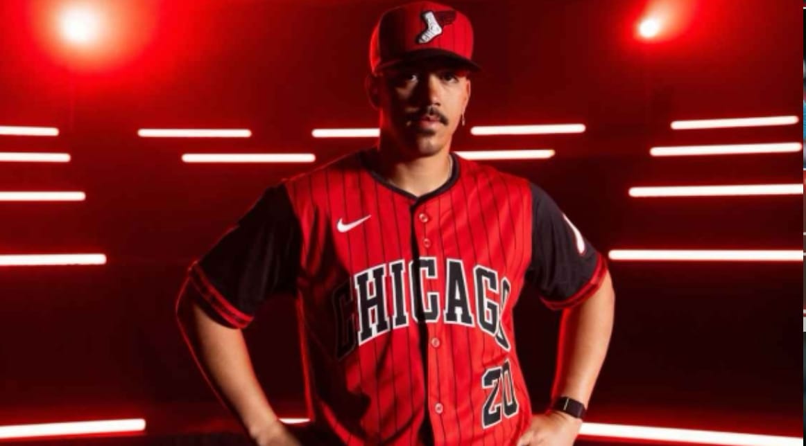
11. I like the font for the “CHICAGO” across and the number “20”. I like the hats, and the logo/patch on the left shoulder. I like the two red stripes on both shoulders. I’m not sure red is the White Sox’s color. I also would have prefered that the swoosh on the right lower shoulder is black. Rating: 5/10
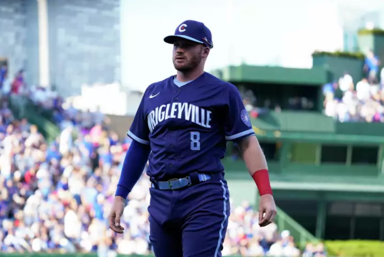
10. The “WRIGLEYVILLE” across the chest is clean, and the number is a good power blue. The hat is blue with a power blue rim. It has a “C” with a red star, which is a good addition. I like the power blue belt. The patch on the left shoulder is ok, since it’s blue. I’m not in love with the color of the swoosh on the lower left shoulder. I also would have prefered light pants with a darker stripe. Kinda repetitive with the colors. Rating: 6/10
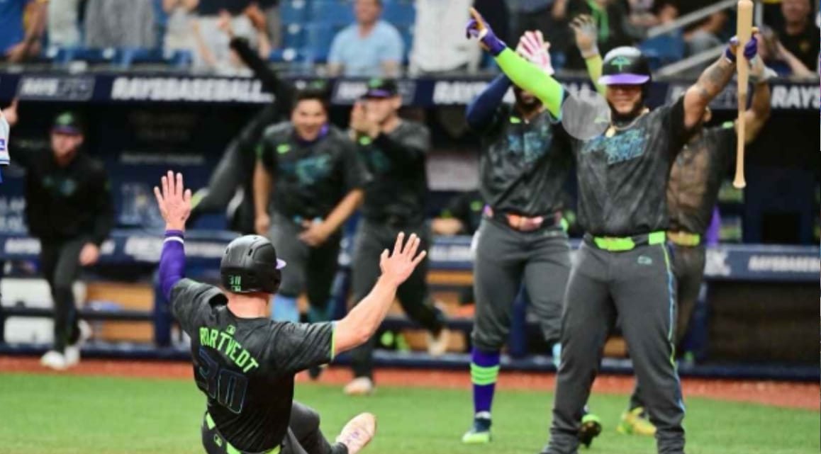
9. The green belt, and blue and green stripes are good touches. The “TAMPA BAY” is pretty colorful, and flashy. The black pants and top tones the color down a bit, which is good. I like the helmet, but the purple rim is a little bit much. Rating: 6.4/10
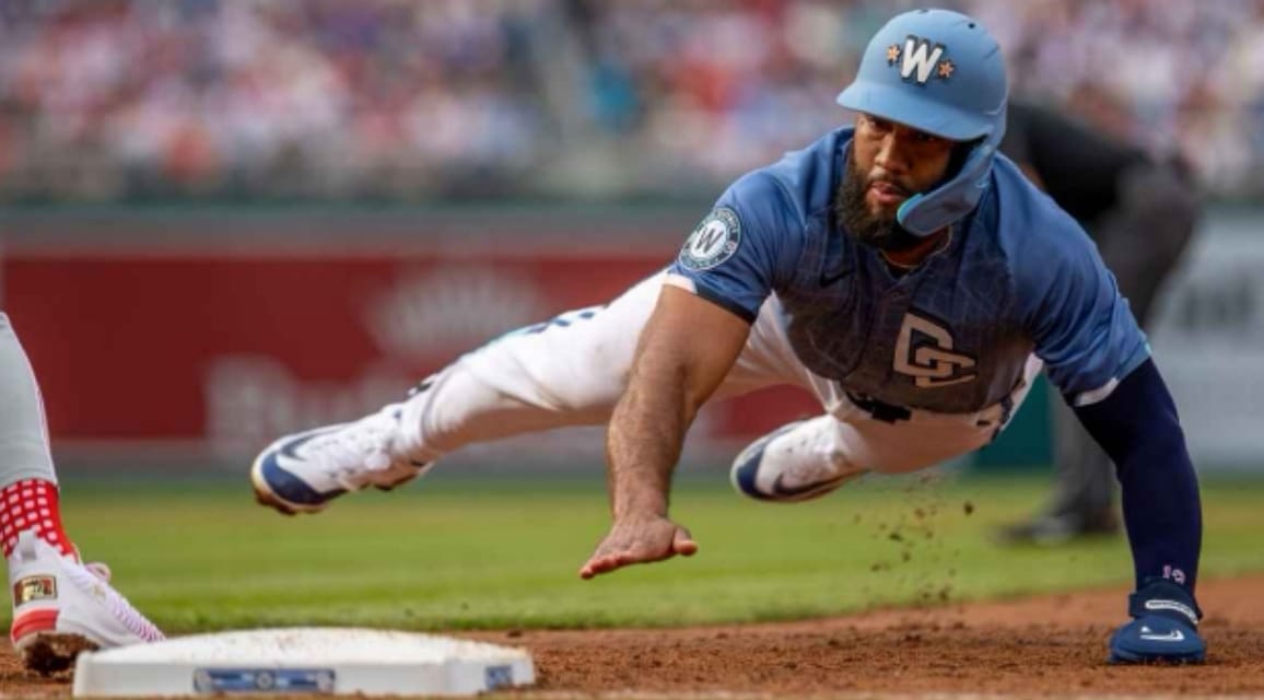
8. The helmet is pretty slick with the “W” and the pink flowers. I like the interlinked “DC” and the patch on the right shoulder. The color is a nice gray/blue, and the gray/blue belt goes along nicely. It’s not too colorful though, and I would choose grayish blue pants for the players. Rating: 6.5/10
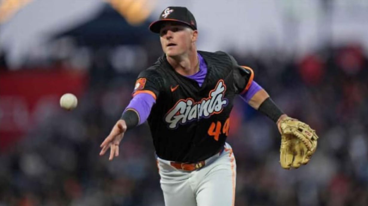
7. The “Giants” on the front is pretty cool. I like the orange and purple border around it. I like the “SF” hat, and orange bordered sleeves. I like the patch on the right shoulder, as it matches their other colors. The orange stripe down the pants isn’t bad and the belt is colorful. I’m in love with the orange number, and the subtle gray stripes on the black jersey. Rating: 7/10
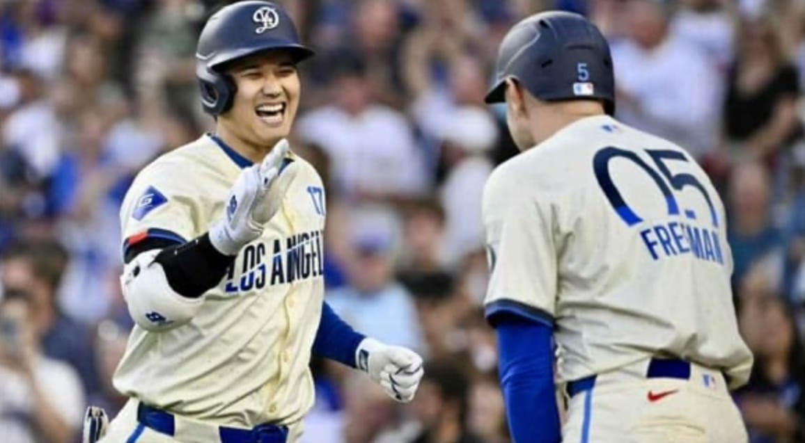
6. The “LOS ANGELES” across the front is a good color and font. I like the blue belt and stripes on the pants. The patch on the right shoulder actually matches the jersey. I like the number, and name on the back. I wouldn’t have chosen the color cream for the city connects, and the number on the front is too small. The red swoosh on the back of the pants is weird. I don’t know why they didn’t do blue. The “D” on the helmet is both kinda cool, and boring. Rating: 7.6/10
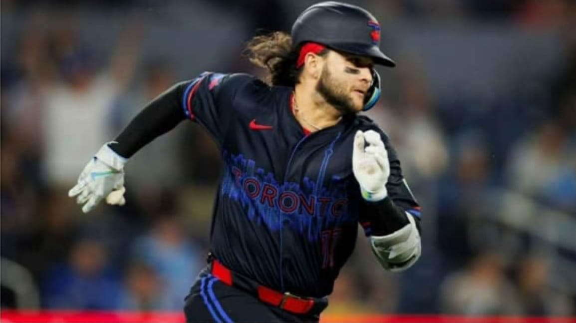
5. The red, blue, and black go together very nicely. I like the “TORONTO” on the front, and the blue city that goes along with it. The red belt is nice, and the helmet is kinda fun. The stripes on the sleeves are what I would’ve done. I’m not in love with the double outlined font for the number. There are two blue stripes going down the pants, but it would’ve looked better if it was one blue, and the other red. Rating: 8.2/10
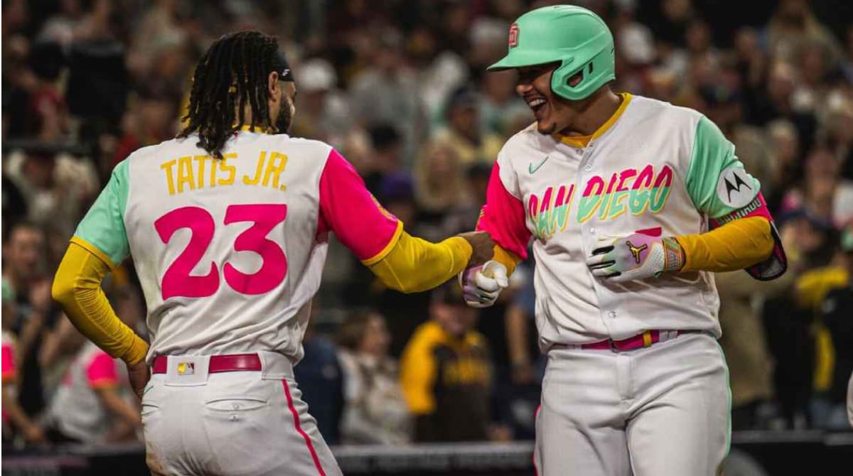
4. The San Diego is great double coloring, I like both sleeves, as they are two colors. I like the pink belt, and the stripes going down the pAnts. The helmet is fun, but I would’ve preferred a more fun logo. I also would’ve changed the color of the pants. Rating: 8.5/10
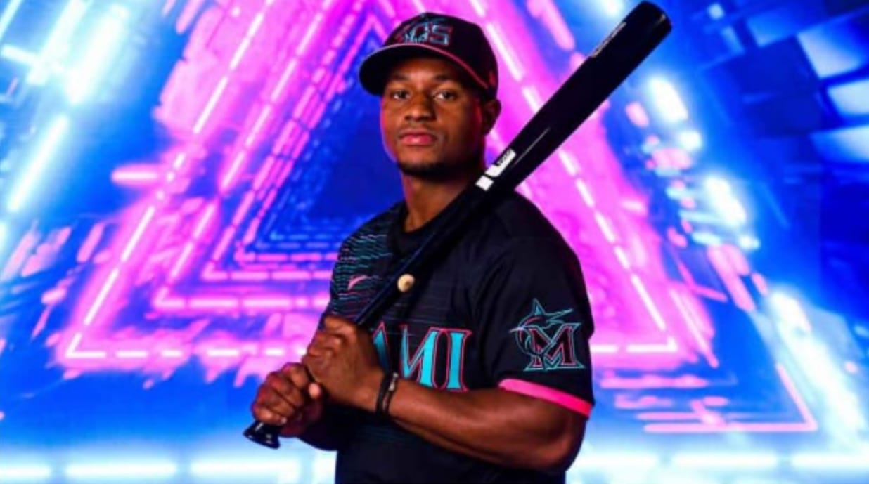
3. The Miami Marlin city connect uniforms are very bright, but awesome. I like the blue, purple and pink lines that fade as you go across the jersey. I like the cyan and pink “MIAMI” on the front, and the hats are ok. The only thing I don't love is the pink rim around the sleeves, and hat. Rating: 8.7/10
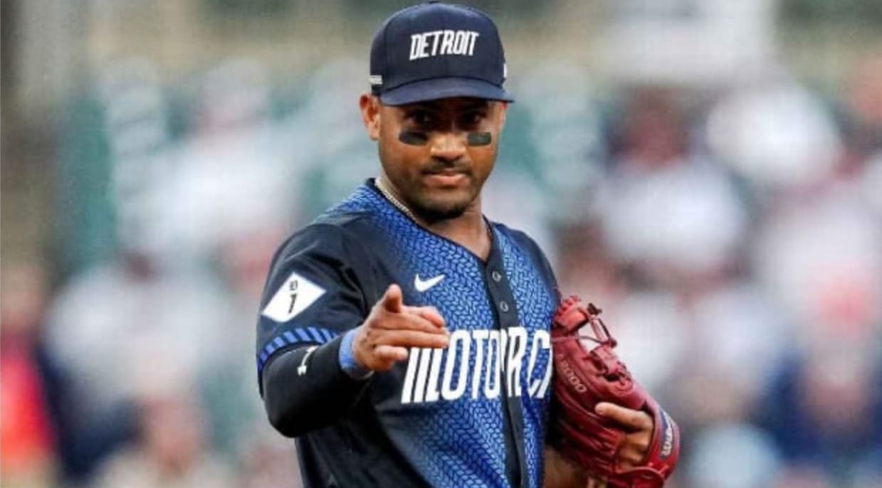
2. The blue and black go well together, along with the white “Motor City”. The black sleeves with blue and black stripes are a good touch. I’m not in love with the plain “DETROIT” hat, but the font is pretty cool. Rating: 9/10
1. This is a really clean uniform. The light to dark contrast, the lettering, and the colors. I love the hat, and the yellow stars around it. I love the font and lettering of “PHILLY”. The only thing I don’t love is the patch on the left shoulder. It just kinda takes away from the jersey itself. Rating: 9.5/10

Are your eyes blind yet?
Note: This article was requested by my mother, and I am making it for Mother’s day.