Ranking the 8 New MLB City Connect Jerseys
I have previously written an article on ranking MLB City Connect uniforms, but since eight teams unveiled new City Connect jerseys on April 9th, I decided to give them a look and rank them (8 being the worst and 1 being the best) on a scale of one to ten, starting at number 8.
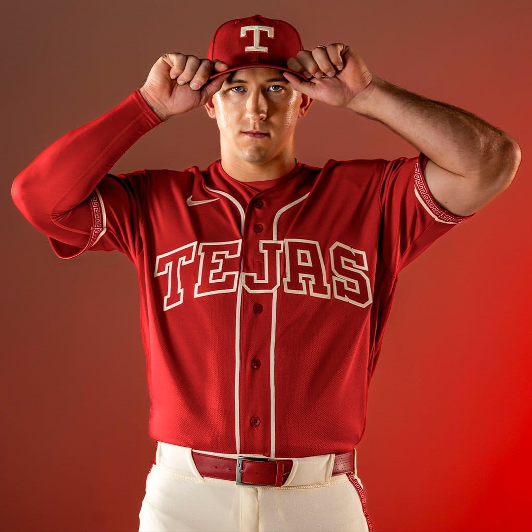
8) This may be the most boring uniform in all of baseball. I don’t really know what the Rangers were going for, but it’s just an all red uniform (with white stripes) saying ”Texas” in Spanish. These aren’t even fun to look at, and they are super simple.
Rating: 1.5/10
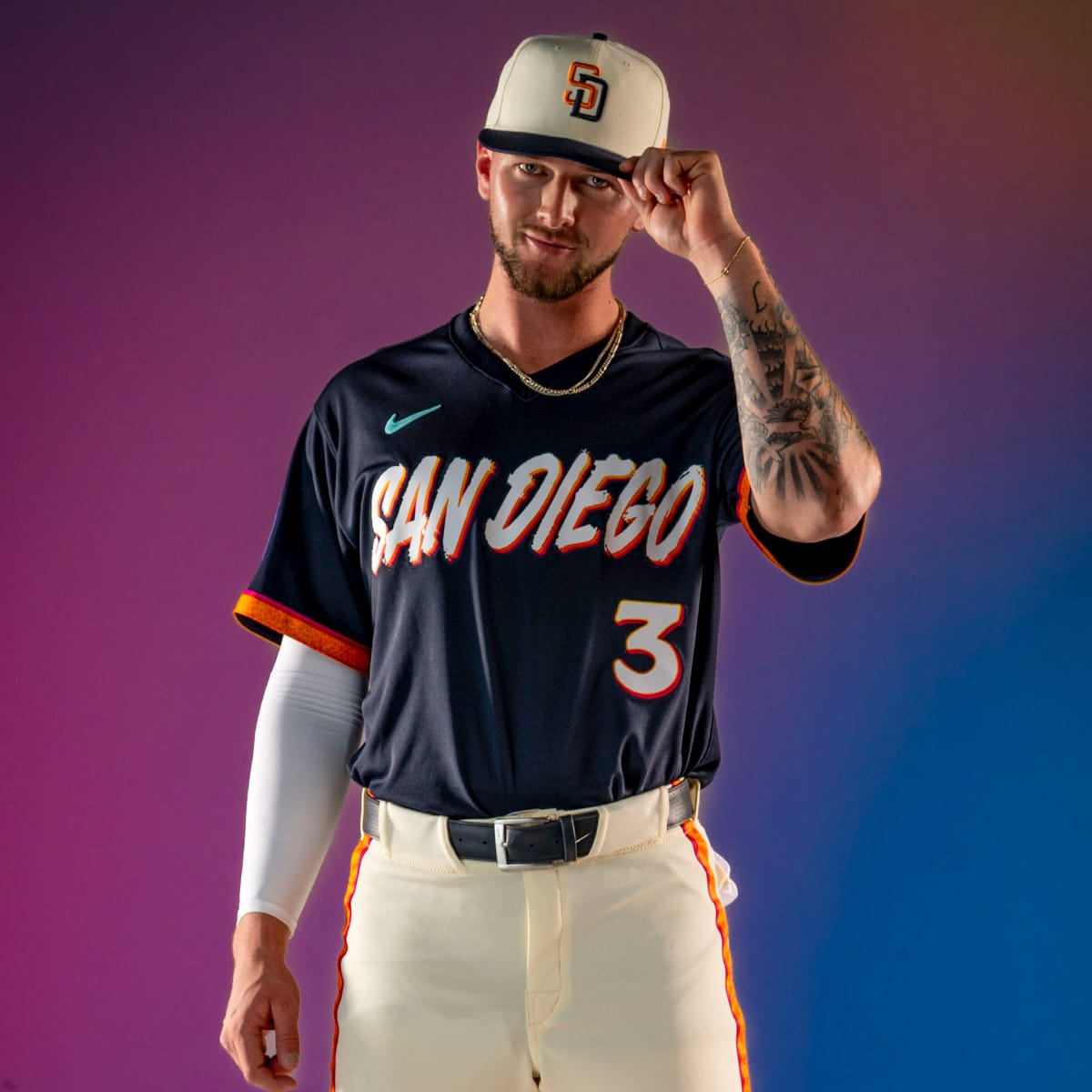
7) I don’t get the orange in their uniforms, but I do like the lettering in the “San Diego” as well as the blue Nike logo. The hats are pretty standard with the only change being the color. The outline of the number on the uniform fades very nicely. Again, somewhat of a boring jersey.
Rating: 3.5/10
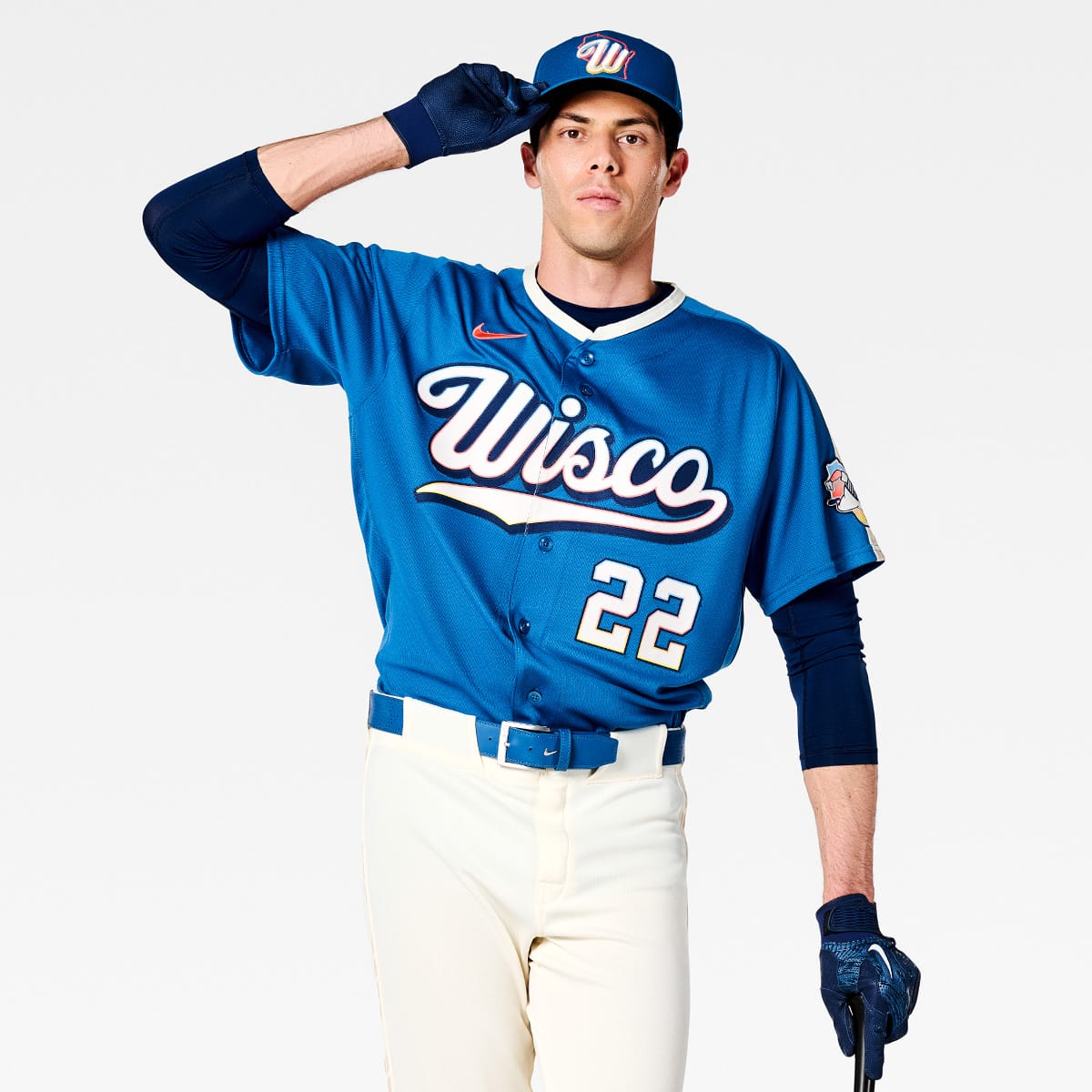
6) I like the blue color they used, but I don’t really think anybody calls Wisconsin “Wisco” and that is what is front and center on the jersey. The hat is nice with the blue, orange, and yellow outline around the “W” and an orange outline around the state. I would change the color of the Nike swoosh as the red just looks bad on the blue background.
Rating: 4/10
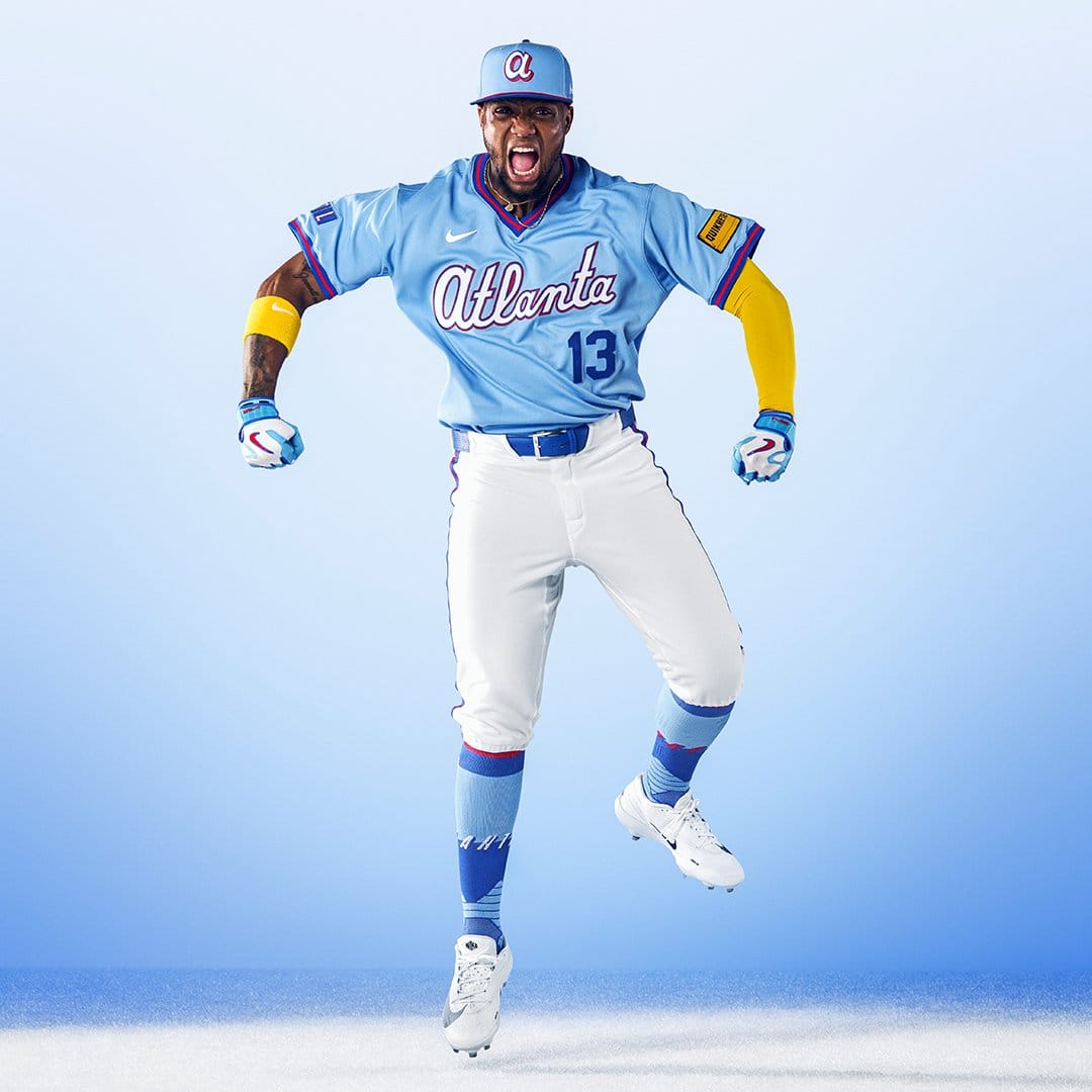
5) The coloring of the jersey is nice with the blue, darker blue, and red. The socks pair very well with the uniform. The “A” on the hat is kinda simple, but I don’t mind it that much. But the yellow patch on the arm looks horrible, and the jersey number is standard and dull.
Rating: 5.5/10
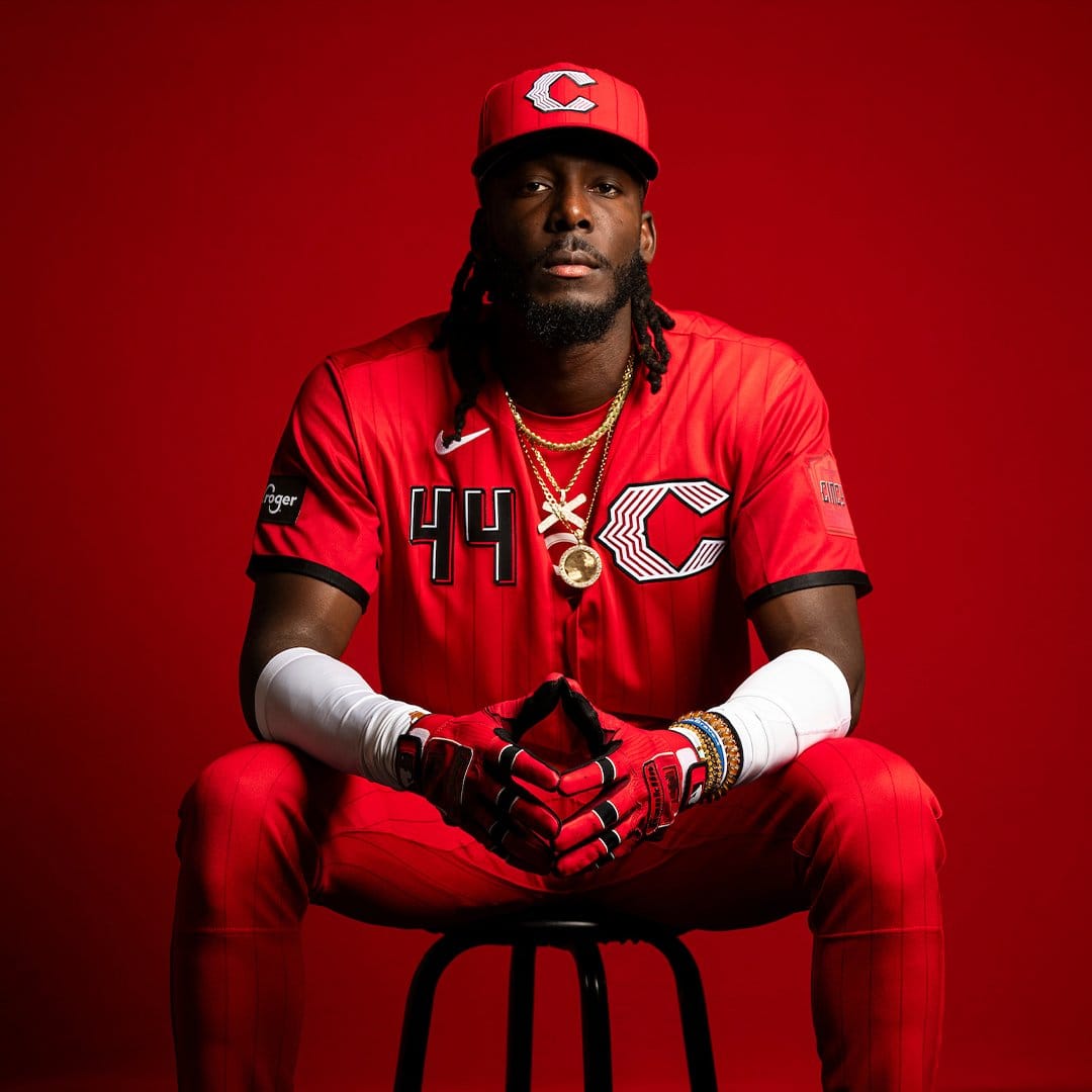
4) The “C” is not much different from their previous City Connect uni, but the red and black pair very well together. Even the sponsorship patches (and the Nike logo) on the arms go with the jersey. It would be nice if the number was bigger, and the jersey is kind of the same as their uniforms in years prior.
Rating: 6/10
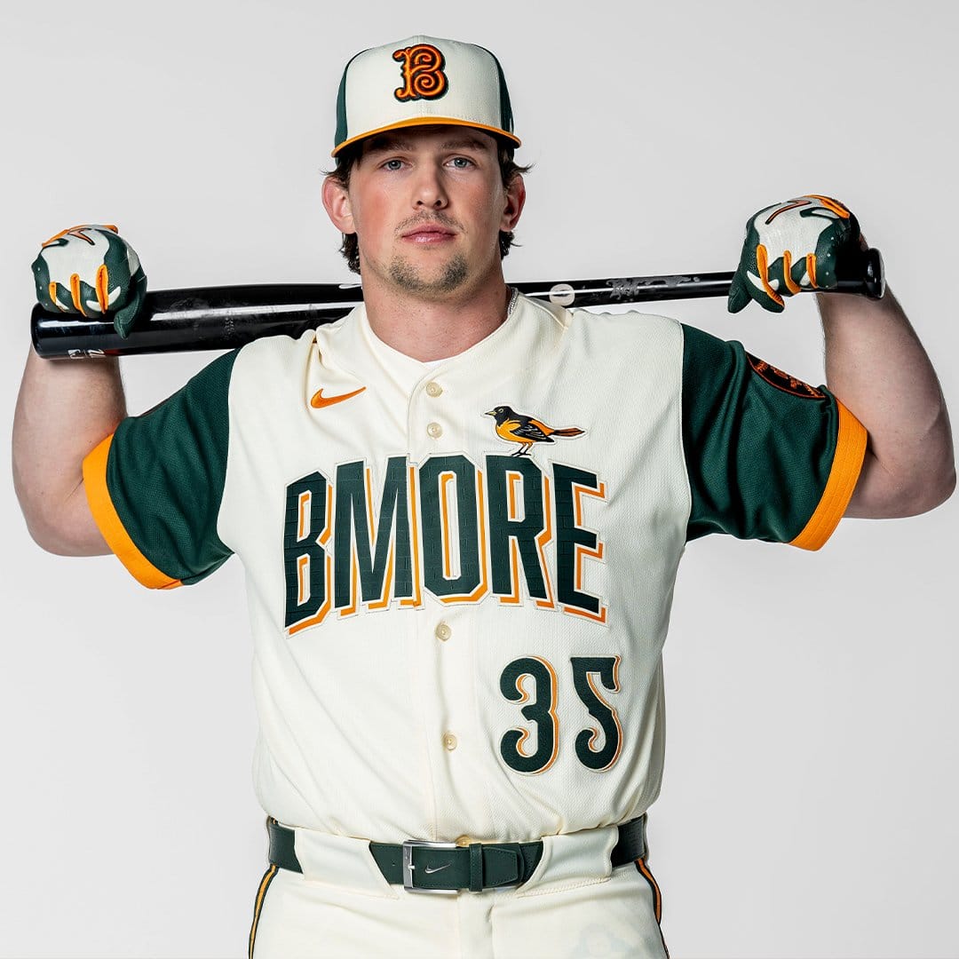
3) This one is like the Brewers’ City Connect jerseys, with the local nickname. I still don’t think any one calls Baltimore “Bmore” but other than that the rest of the jersey is very creative. The numbering is fun, as well as the double font for the letters on the front of the uniform. My favorite part is the Oriole bird perched on the R in “BMORE.” The hat is alright; I’m not sure I love the swirly look, but the sleeves and the pinstripes on the pants complete the look.
Rating: 7/10
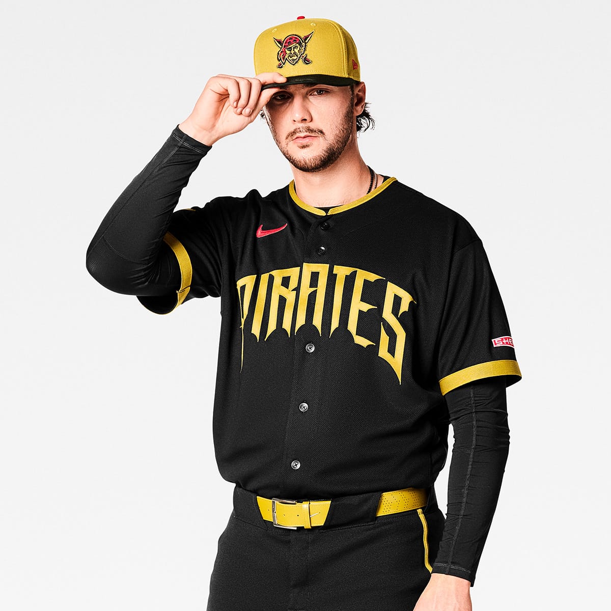
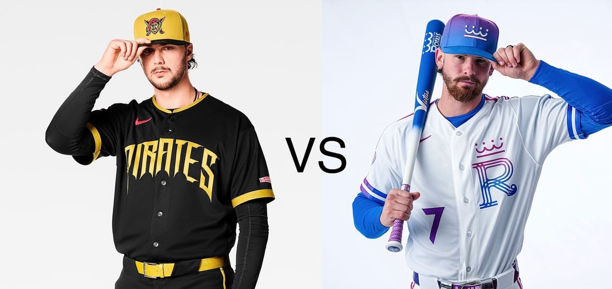
2) The black and gold/yellow just goes so well for the Pirates. The hat is absolutely the best part of the uniform. The Pirates logo on the hat and font on the front of the jersey is very fun! The belt and the pinstripes also look very good. As for the sleeves, the gold on them looks good, but the red sponsorship patch and the red Nike logo both throw off the outfit. It would also be nice if they put numbers on the front of the jersey.
Rating: 8.5/10
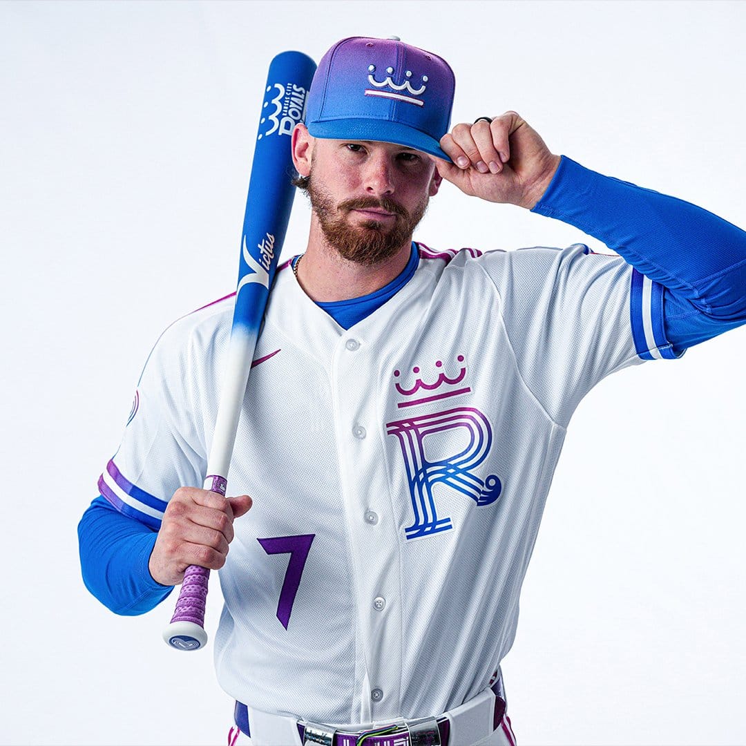
1) These could be the best jerseys (not just City Connect jerseys) in MLB right now! The fade on the hat, the “R,” and the sleeves are just so clean. The number is visible and goes with the jersey. If I had to be really nit-picky, I would wish for the pinstripes to fade and for the crown on the “R” and the hat to look less cartoony. The Nike swoosh matches the jersey and even though you can’t see much of the sponsorship patch, the little that you can see looks multi-colored and blends well. The Royals hit the nail on the head with this one.
Rating: 9.5/10
I plan to write an article on re-ranking all of the City Connect jerseys, as some teams have changed theirs or discontinued them. Thanks for reading!